

Showing posts with label ipad. Show all posts
Showing posts with label ipad. Show all posts
Tuesday, May 8, 2012
Critique: Vox 5 cover
After a long time without having to think about iPad applications at all, it was finally my turn to do a Vox 5 cover. I was pretty nervous going into it. Everyone has made some pretty sick covers and I was worried I wouldn't live up to the standards. In reality, I am obsessed with the cover I produced. Throughout the duration of this class, I didn't push myself to do enough work with photoshop and super crazy typography. I made up for it by making this cover:
 I used The Polyphonic Spree as my cover inspiration. While I am not totally familiar with the band, I did my background research and found all their cover art. They use crazy 3D letters and crazy background art. Therefore, I wanted to go all out and make a Vox 5 cover that I could picture as theirs. I am very happy with the final product, although I know that some of the smaller white text is a bit tough to read. It's a small price to pay for this end result I suppose.
Wednesday, February 29, 2012
Critique: iPad take 2
This week I was back on the iPad. In fact, I am sitting in the Vox office finishing it up right now. I'm just going to give you a preview of the spread I like best from the issue. Next week I'll show the whole thing.


This week I was assigned to do departments, and these images are from the arts section. I ended up doing arts, scene, endnotes and the TOC.
I liked the secondary where I was able to play with text placement a little more than with some of the straight stories we publish. It was more fun from a design perspective. I also just really like the image from the splash page, mostly because I love coffee and she's holding a coffee mug.
I think that I could have found a better way to break up the two stories, although I am not upset with how it turned out. If I had some more space I would have tried to play with some other things, but I did not have that liberty. Maybe even just playing with the color of the line break would work. Maybe I'll run that by Dayne, I don't know.
I think this week went much better with the iPad. Since I knew what I was doing and what to expect I was able to plan my time better. I also had correct templates to use so I didn't spend 3 hours designing the wrong way. That was definitely a plus.
After doing both departments and features, I think that I prefer the features. There was a lot more liberty to play with design which I really enjoyed. I think when I go back to do the iPad again I'll ask to do the feature.
Wednesday, February 15, 2012
Critique: iPad 02/09/12
Sorry in advance but these feature images are in reverse order, so please bare with me.
Last week I was in the first group of iPad app designers. The app is a weekly version of Vox that is transformed into a iPad application. I was in charge of the cover, TOC and afterlife feature package. Between creating the landscape and portrait versions of each of these I designed a total of 32 pages in 2 days. While we hit a few bumps in the process due to being the first group and some of the templates being wrong, it was a great experience. I really enjoyed the process and that you have a bit more freedom with designing. I have included my features in both landscape and portrait versions on here.
PORTRAIT:


LANDSCAPE


Overall I am pleased with the feature. It was nice because I was able to use the print version as a building block, for example I kept the splash page from print, but I was able to add my own touches. I used dotted lines with new story titles rather than the parenthesis that they used in print. I wish I had done a little bit more with the artwork. On a few pages all I had to use was a pull quote which wasn't ideal for my design. I wish I had time to create an illustration or find more photos.
I am pleased with my sidebars, however. I really like how the clouds turned out behind the text.
While I was extremely frustrated while working on the iPad, I really like the final product. I'm really excited to do my second issue in about two weeks.
Wednesday, February 8, 2012
Response: iPad discussion
This past week in class Theresa told us how while a friend was looking over her design portfolio, the friend's boss saw that she had iPad experience. The boss was shocked that a college student could have experience with iPad application production. This goes to show how valuable our iPad experience will be. While I may be frustrated with the work now, it will pay off in the future when it comes time to apply for jobs. Being able to show the ability to design not only magazine pages, but also iPad pages, is extremely valuable in this industry and can set us apart from other job applicants. I am so excited to work more with the iPad and see what other opportunities it can offer.
Critique: iPad
This week Whitney and I worked on the first issue of the Vox Weekly iPad app. I am currently on hour 14 of work and am still not done. As much work as it is, I actually like iPads. You have more freedom in your work space and have more options for how to set up pages. It is a lot of fun, but since we are the first group to produce an app we have hit some snags. For example, some templates were incorrect and set us back a bit, but overall it has been a great experience. I am still not done working, but here is an example of a contents page that is currently in progress:
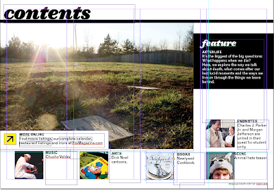
I wish I had more to show, but we are still working on completing the application. I promise next week I will have more! All I can say for now is I am running on 4 hours of sleep, still have an app to finish, 3 covers to design and am just praying I get some sleep.

I wish I had more to show, but we are still working on completing the application. I promise next week I will have more! All I can say for now is I am running on 4 hours of sleep, still have an app to finish, 3 covers to design and am just praying I get some sleep.
Subscribe to:
Posts (Atom)