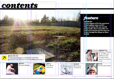
This week I was back on the iPad. In fact, I am sitting in the Vox office finishing it up right now. I'm just going to give you a preview of the spread I like best from the issue. Next week I'll show the whole thing.
This week I was assigned to do departments, and these images are from the arts section. I ended up doing arts, scene, endnotes and the TOC.
I liked the secondary where I was able to play with text placement a little more than with some of the straight stories we publish. It was more fun from a design perspective. I also just really like the image from the splash page, mostly because I love coffee and she's holding a coffee mug.
I think that I could have found a better way to break up the two stories, although I am not upset with how it turned out. If I had some more space I would have tried to play with some other things, but I did not have that liberty. Maybe even just playing with the color of the line break would work. Maybe I'll run that by Dayne, I don't know.
I think this week went much better with the iPad. Since I knew what I was doing and what to expect I was able to plan my time better. I also had correct templates to use so I didn't spend 3 hours designing the wrong way. That was definitely a plus.
After doing both departments and features, I think that I prefer the features. There was a lot more liberty to play with design which I really enjoyed. I think when I go back to do the iPad again I'll ask to do the feature.
Wednesday, February 29, 2012
Response: History presentations
This week we each did a short presentation on a magazine before the '70s. I ended up with Vogue from 1910-1919.
This project was very interesting for me. I had never looked at such an old magazine, in fact I had no clue Vogue had been around for so long. The biggest thing I found was how they used illustration covers and hired different artists to do different covers. This is very similar to how a magazine would hire a photographer to do a specific cover shoot for them. It was also interesting to see how they did not have a "branded" logo yet. On many covers, the title of the magazine was drawn differently. In current times, magazines would never do that. They have a specific typeface that they use on each cover so that they have a recognizable identity. This was not the case for Vogue at the time, and it was not the case for many other magazines that my fellow designers studied. It goes to show that a magazine can be successful even if they do not want to keep one typeface for their name. As long as the title is legible, a reader will know what they are buying and still want to read the magazine. In fact, I would probably be more drawn to a cover with a clever, integrated title that showed a lot of thought went into how to write the title. But that could just be because I love typography and am a designer.
Anyways, here are some covers for you to check out:
You can't miss: should we edit photos
I was checking out Glamour's website the other day when I stumbled across an article about photo editing.It shows these before and after images and asks the readers what they think about the editing that has been done.
Since this will inevitably be part of some of our jobs, I wanted to see how you guys felt on the issue. I think some photo retouching is necessary, but these don't even look like the same people. I think this is a bit too much. What about you?
Wednesday, February 22, 2012
You Can't Miss: Typography videos
Well, originally I was planning on posting the Cats as Fonts, but Will beat me to it. I'm just glad someone showed it to y'all because when I saw it I practically died of laughter and then immediately thought of LeeAnn.
Anyways, instead I have these two Youtube videos that I had found a while back that play with typography. Incase you haven't noticed by now, I'm obsessed with typography. One is hooked up with audio from the movie "The Dark Knight" and the other is an I love NY typography deal. Both are really fun and show off some great typography skills. Hope you enjoy them as much as I do!
Critique: Wilderness Feature
Let me begin by saying, sorry designers. I am writing this post from my apartment and due to getting a new computer I can't get my laptop to connect to mofiles right now, so I will not be able to upload photos of the feature until tomorrow. But I promise to get online and add them as soon as I have access to the server!
I really do like how this feature turned out. It looks much different than the original feature that Andrea and I created. We found better typefaces to use and a more "wilderness" style color palette. We also made it look less "girly" as the editors had described it. With the help of Timmy, we also came up with a better photo edit. The sidebars also work a lot better now.
The experience of working on the feature with another designer was great. Andrea and I worked very well together and were able to work fast and efficiently. We also had similar ideas on how to design, what photos to use and what typography and colors we liked, making it easy to collaborate. I'm really excited to see how the story turns out in print.
I have a lot of work coming up this next week. Once again I am back on the iPad app. I also have to bring in an updated Simplicity cover for Thursday. Not to mention working on the history project. Wish me luck! With iPad work around the corner I'll need it.
Response: Magazine Prototype Presentations
This week we presented our magazine prototypes to our publishing teams. I was extremely nervous. You remember the prototype I posted last week? Well, my laptop's logic board crashed on Wednesday evening and I had no laptop until Monday morning. This meant that I lost my entire prototype, and due to other obligations I could not start to remake it until Sunday afternoon. Fortunately, minus the cover, I liked everything about this new version better than the original. My publishing group changed their feature for the publication, causing my cover concept to change, and while I am not upset with the way it came out I do prefer the cover from last week a bit better. I had some trouble placing my sell lines on the new cover. Here is my new prototype:
I ended up choosing to use the canvas box on all of my pages. I made this decision based on feedback from my fellow designers. I realized that it would be a good way to brand the magazine. I also kept the same concept for the department page, although I tweaked it by finding a better image.
My main focus was making everything "user-friendly" so that someone could skim it for quick information or read it thoroughly if they chose to do so. That's why the feature had many pull out info sections along with space for real body copy. I also tried to keep things consistent with how I pulled out information in the department and the feature. I thought this would make it more efficient for a reader. Despite not being chosen as creative director for the project I am still very happy with the work I produced. I am going to tweak the cover and play with the sell lines a bit though. And after seeing Krista's work I am excited to work on the project.
I think the toughest thing for me was having to present this to the publishing group. It was tough to have to explain every single decision I made. While I just explained a few of my decisions on here, it's hard to think of everything as you're going and make sure you explain everything so that the publishers, some of whom have no design experience, can understand the concepts. For example, they wanted a bright color palette. This sounds great in theory, but bright to a designer can be a lot different than bright to a non-designer because we know that too bright will look cheesy. They were also worried about over-using photos, which I think are great to use.
All in all this was a great experience and has me a little bit less nervous for our final magazine presentations in May. Now it's just time to get to work!
I ended up choosing to use the canvas box on all of my pages. I made this decision based on feedback from my fellow designers. I realized that it would be a good way to brand the magazine. I also kept the same concept for the department page, although I tweaked it by finding a better image.
My main focus was making everything "user-friendly" so that someone could skim it for quick information or read it thoroughly if they chose to do so. That's why the feature had many pull out info sections along with space for real body copy. I also tried to keep things consistent with how I pulled out information in the department and the feature. I thought this would make it more efficient for a reader. Despite not being chosen as creative director for the project I am still very happy with the work I produced. I am going to tweak the cover and play with the sell lines a bit though. And after seeing Krista's work I am excited to work on the project.
I think the toughest thing for me was having to present this to the publishing group. It was tough to have to explain every single decision I made. While I just explained a few of my decisions on here, it's hard to think of everything as you're going and make sure you explain everything so that the publishers, some of whom have no design experience, can understand the concepts. For example, they wanted a bright color palette. This sounds great in theory, but bright to a designer can be a lot different than bright to a non-designer because we know that too bright will look cheesy. They were also worried about over-using photos, which I think are great to use.
All in all this was a great experience and has me a little bit less nervous for our final magazine presentations in May. Now it's just time to get to work!
Wednesday, February 15, 2012
Critique: iPad 02/09/12
Sorry in advance but these feature images are in reverse order, so please bare with me.
Last week I was in the first group of iPad app designers. The app is a weekly version of Vox that is transformed into a iPad application. I was in charge of the cover, TOC and afterlife feature package. Between creating the landscape and portrait versions of each of these I designed a total of 32 pages in 2 days. While we hit a few bumps in the process due to being the first group and some of the templates being wrong, it was a great experience. I really enjoyed the process and that you have a bit more freedom with designing. I have included my features in both landscape and portrait versions on here.
PORTRAIT:
LANDSCAPE
Overall I am pleased with the feature. It was nice because I was able to use the print version as a building block, for example I kept the splash page from print, but I was able to add my own touches. I used dotted lines with new story titles rather than the parenthesis that they used in print. I wish I had done a little bit more with the artwork. On a few pages all I had to use was a pull quote which wasn't ideal for my design. I wish I had time to create an illustration or find more photos.
I am pleased with my sidebars, however. I really like how the clouds turned out behind the text.
While I was extremely frustrated while working on the iPad, I really like the final product. I'm really excited to do my second issue in about two weeks.
Last week I was in the first group of iPad app designers. The app is a weekly version of Vox that is transformed into a iPad application. I was in charge of the cover, TOC and afterlife feature package. Between creating the landscape and portrait versions of each of these I designed a total of 32 pages in 2 days. While we hit a few bumps in the process due to being the first group and some of the templates being wrong, it was a great experience. I really enjoyed the process and that you have a bit more freedom with designing. I have included my features in both landscape and portrait versions on here.
PORTRAIT:
LANDSCAPE
Overall I am pleased with the feature. It was nice because I was able to use the print version as a building block, for example I kept the splash page from print, but I was able to add my own touches. I used dotted lines with new story titles rather than the parenthesis that they used in print. I wish I had done a little bit more with the artwork. On a few pages all I had to use was a pull quote which wasn't ideal for my design. I wish I had time to create an illustration or find more photos.
I am pleased with my sidebars, however. I really like how the clouds turned out behind the text.
While I was extremely frustrated while working on the iPad, I really like the final product. I'm really excited to do my second issue in about two weeks.
Response: Prototype Critique
This week in class we started critiquing our magazine prototypes. I showed my cover and a feature design along with a potential logo for my home decor magazine, Home Canvas. I wanted to respond to something I found interesting with my critique. To begin, here are the two pages:
While I have many things to continue working on, I want to focus on one comment made by my fellow designers. When I exported the PDF files, purple boxes showed up around the pages, about an inch from each edge. (When I exported the files as blogger-supported images the boxes were lost). The original plan was not to have the boxes, but the class seemed to like them. I am now considering putting them back in for when I show the work next week. Or I might make my masthead have the canvas box around it. I plan on playing with this concept as I work on my prototype more.
I also need to use another color other than purple. My department page is covered in purple, which while I enjoy this color, is overwhelming and was mentioned several times during my in-class critique. There are a few other things that I am going to continue to play with this weekend, but overall my biggest surprise was the idea of the canvas-like boxes on my pages. I can't believe designers thought it was a good idea. I would have never thought to do that.
You can't miss: journalism valentine's
In the spirit of Valentine's Day I wanted to share something that a fellow journalism student showed me yesterday. This comes from Mediabistro and just happens to be Valentine's for journalists. These two are my personal favorites:
Not only are they witty, but they also play with typography, which, if you haven't noticed yet, is one of my favorite things designers can do. The conflict of interest one is especially cute in terms of its typography. It's very subtle, with hearts to dot the eyes, but also the connected "N" is very nice. It shows a couple, like two people being together. It's simple touches like this that make a huge difference in design, especially when a design is made solely of typography.
Which is your favorite valentine?
Wednesday, February 8, 2012
You Can't Miss: Campaign Logos
This week I found some interesing campaign logos on logodesignlove.com. They showed a variety of logos, each of which was extremely effective for their candidates. All of the logos can be found here. I particularly enjoyed these two:
Both work for a variety of reasons and while they have definite similarities, it's interesting to see how both use the same color scheme- red, white and blue. This is stereotypically American (like the colors of the flag) therefore, they work well for presidential campaigns. They provoke the idea of patriotism, unity and American values.
With our magazine prototypes coming up, and our need to pick a color scheme for our publication as part of the requirement, it is very important that we remember how certain colors can provoke different emotions and use this to our advantage.
Response: iPad discussion
This past week in class Theresa told us how while a friend was looking over her design portfolio, the friend's boss saw that she had iPad experience. The boss was shocked that a college student could have experience with iPad application production. This goes to show how valuable our iPad experience will be. While I may be frustrated with the work now, it will pay off in the future when it comes time to apply for jobs. Being able to show the ability to design not only magazine pages, but also iPad pages, is extremely valuable in this industry and can set us apart from other job applicants. I am so excited to work more with the iPad and see what other opportunities it can offer.
Critique: iPad
This week Whitney and I worked on the first issue of the Vox Weekly iPad app. I am currently on hour 14 of work and am still not done. As much work as it is, I actually like iPads. You have more freedom in your work space and have more options for how to set up pages. It is a lot of fun, but since we are the first group to produce an app we have hit some snags. For example, some templates were incorrect and set us back a bit, but overall it has been a great experience. I am still not done working, but here is an example of a contents page that is currently in progress:
I wish I had more to show, but we are still working on completing the application. I promise next week I will have more! All I can say for now is I am running on 4 hours of sleep, still have an app to finish, 3 covers to design and am just praying I get some sleep.
Wednesday, February 1, 2012
Critique: Spring Preview
This past week my capstone had another competition where we each created a cover, splash page and spread for the Spring Preview issue of Vox. Overall, I think my work had some ups and downs.
My favorite part of my package was my cover. I decided to go with a spring cleaning theme, focusing on a garage sale type scene for my cover. I went with a very cartoonish feel, doing everything as illustrations. This is how my cover turned out:
I really enjoyed making the stories into things for sale, like the Eli Young Band guitar and Super Bowl football. It was a really fun cover to get to work on.
Unfortunately, I was not as pleased with my splash pages or spread. I ended up doing two splash pages, both using only typography, for this competition. In all honesty, I wasn't very happy with either, and I wish I had found a better way to do them. I was worried it would turn out too similar to the cover, so I chose to play solely with typography. I feel like it ended up giving off a retro vibe rather than a spring feel, though. Here are my two splash pages:
When it came to my spread, I wanted to keep the same color scheme as the splash page(s). I decided that, should I end up creating the issue, I wanted to break up the events by month. I think it's easier so that people could just go to the month they wanted information on and find it that way. I was very intent on making this an audience-friendly spread. Overall, I think the spread is alright. If I had found a more creative way to create my splash page I think I could have done a bit of a better job with the spread, but for what I was working with I feel I made the most of it. Here is how the spread came out:
Next week I will be starting to work on my cover options with my cover group. I will also be starting to work on my publish prototype, although we are still waiting to hear which magazines we will be working with. Finally, next weekend (the 11th) I will be working on my first department weekend for Vox. I'm really excited to get more work with the magazine.
Subscribe to:
Posts (Atom)